
A visitor who leaves without clicking is a lost opportunity forever – and according to HubSpot, 55% of users abandon a purchase when a site's content is poor quality. This isn't a matter of insufficient traffic. It's a matter of conversion.
The good news: the obstacles are identifiable, and they can be fixed. Here's how to turn your site into a convincing machine.
What the visitor feels before (not) clicking
Web hesitation is a simple cognitive mechanism: as soon as the brain perceives doubt – about what will happen, about the benefit gained, about the site's reliability – it chooses the path of least resistance: closing the tab.
An effective call to action (CTA) isn't just a well-designed button. It's a promise. It must answer your visitor's unspoken question in less than a second: "Why am I clicking?"
In the field, we constantly observe the same scene: an entrepreneur proud of their newly revamped site, with a nice "Send" button at the bottom of the page, wonders why no one is contacting them. The problem isn't aesthetic. It's semantic and strategic.
The 4 main reasons blocking your conversions
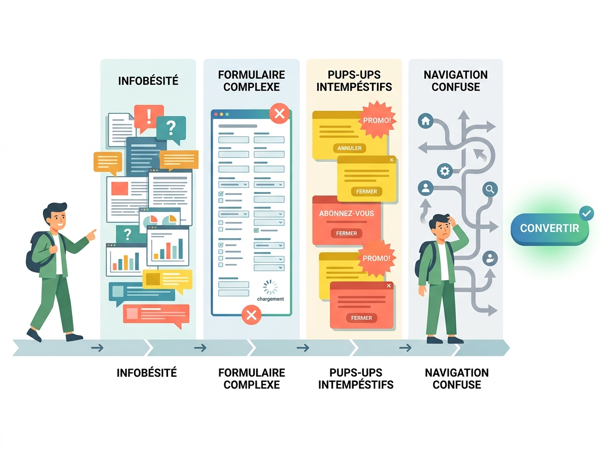
Before correcting, you need to diagnose. Here are the four errors found on the majority of SME websites.
1. A CTA that's too vague
"Send," "Submit," "Validate": these phrases say nothing about what awaits the visitor on the other side. Doubt sets in, and the click doesn't happen. A CTA must describe the action AND its result – for example, "Receive my free audit" or "Book my demo in 2 minutes."
2. An absent or unclear value proposition
The visitor isn't asking what you do. They're asking what they will gain from it. If your page talks about you – your years of experience, your expertise, your certifications – without ever articulating the concrete benefit for them, they'll disengage. The rule is simple: every content block must answer the question, "What's in it for me?"
3. An invisible or poorly positioned button
A CTA at the bottom of the page, poorly contrasted, without visual hierarchy: it goes unnoticed even by interested visitors. Heatmap studies consistently confirm this – areas "above the fold" account for 80% of clicks. What the eye doesn't see, the hand doesn't click.
4. Too many choices = decision paralysis
Multiplying competing CTAs on the same page – "Contact us," "Download our brochure," "Follow us on LinkedIn," "Sign up for the newsletter" – is tantamount to asking for nothing at all. Faced with several options, visitors often choose the simplest: to leave. One goal per page, one priority CTA: that's the golden rule.
How to write a CTA that triggers action
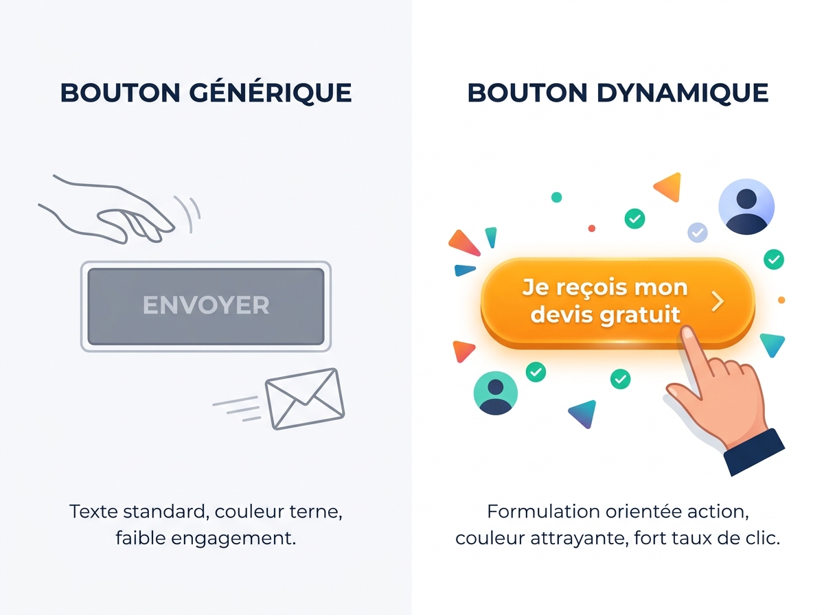
A good call to action relies on three cumulative levers: clarity, immediate benefit, and perceived risk reduction.
Clarity comes from using first-person action verbs:
- "I download the guide"
- "I book my slot"
- "I receive my quote"
This "I" formulation creates a mental projection. The visitor already sees themselves taking action. A/B tests regularly report gains of 10 to 30% in click-through rates with this simple change in wording.
Immediate benefit transforms the CTA into a tangible promise:
- "Improve your visibility this week" > "Learn more"
- "Get a full audit in 48 hours" > "Contact us"
Risk reduction removes the last frictions: "No commitment," "Free," "In 2 minutes" are micro-proofs that tell the visitor that clicking costs them nothing.
Placement and design: the art of making a button irresistible
The best CTA in the world won't convert if it's buried. Some practical rules:
- Position it above the fold: as soon as the visitor arrives, they should see a possible action without scrolling.
- Repeat it 2 to 3 times on a long page: after the pitch, after social proof, at the bottom of the page.
- Ensure visual contrast: a button must stand out from the background. No need for a flashy red – but a colour that clearly contrasts with its surroundings.
- Add micro-info below the button: "Over 300 SMEs supported" or "Response within 24 hours" just below the CTA reinforces the decision.
A practical test: show your page to someone for 5 seconds. If they don't know what to do, your CTA has failed.
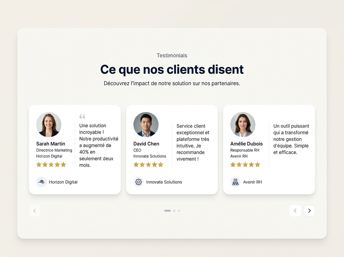
Social proof: the decisive trust factor
Hesitation is often a matter of trust, not interest. The visitor thinks: "It looks good, but does it really work for someone like me?"
This is where social proof comes in, the most powerful mechanism for dispelling doubts:
- Customer testimonials with first name, photo, and professional context ("Valérie, manager of a hair salon in Lyon")
- Ratings and reviews displayed directly on the page (Google, Trustpilot)
- Logos of recognised clients or partners
- Result figures: "82% of our clients see an increase in their traffic within 3 months"
Placing a testimonial just before a CTA mechanically multiplies its effectiveness. The reader is reassured, they click.
This logic directly relates to Digitalyser's e-reputation and customer reviews pillar: your online reputation is not just a matter of notoriety, it's a direct conversion lever.
Test before redoing everything: the CRO approach
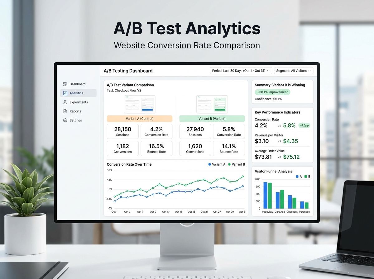
Many SMEs spend weeks redoing their site from top to bottom when a single change – rephrasing a CTA, moving a button, adding a testimonial – can double contact requests.
Conversion Rate Optimisation (CRO) is an iterative process, not a one-shot project. Here's a simple three-step method:
- Identify your high-traffic, low-conversion pages using Google Analytics or a behaviour analysis tool.
- Formulate a hypothesis: "If I replace 'Contact us' with 'Get my free audit,' the click-through rate will increase."
- Test (A/B test) and measure for at least 2 weeks before concluding.
Before touching anything, it's wise to start with a 360° visibility audit to precisely identify which friction points are hindering your visitors – rather than making blind changes.
One page = one goal = one main CTA
This is the simplest and most often violated principle. Every page on your site must have a clear intention: to generate a call, collect an email, download a document, or make an appointment.
If you have six different buttons on your homepage, you're not guiding anyone. You're dispersing attention and diluting the action.
Practically: for each main page, define the number one action you want the visitor to take. Everything else – design, text, visual hierarchy – must serve this single objective.
To go further on your acquisition structure, Digitalyser's SEO services allow you to work simultaneously on qualified traffic and conversion, so that each visitor gained costs less and brings in more.
If you would like a concrete diagnosis of your pages, the free Digitalyser assessment identifies the main obstacles to your conversions in a few minutes – without obligation, and without technical jargon.